Labeling Innovations from Weber

Avoid These Food Label Design Mistakes - Part I

Posted by Margaret O'Leary

May 12, 2014 2:30:36 PM

When you create a label for one of your food products, say a delicious cupcake, you want the label to convey freshness, look appetizing, and give your customer all the information they need to complete the sale.

Your food label design is one of the main tools you have to communicate with your customers. This becomes even more important for brands without a large marketing budget and that are limited to small retail spaces or specialty shops. It's crucial that your label tells your story in an appealing way.

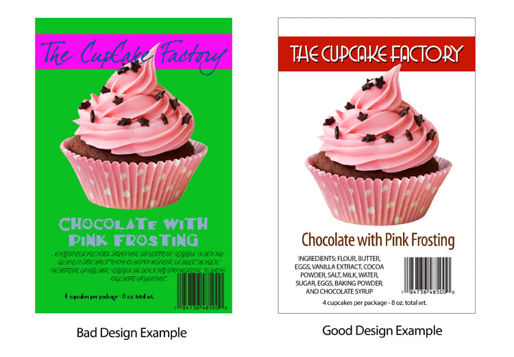
In this two part series, I will share with you some common food label design mistakes and how you can avoid them. To best illustrate this we have designed an example of a "before & after" label incorporating these mistakes and will share some tips for label improvement.


Part I: The Importance of Good Font Choices

Too Many Fonts

No matter which software program you use to design your label, it probably comes with a huge library of fonts. There are so many fonts to choose from when designing your label that it gets tempting to use all your favorites.

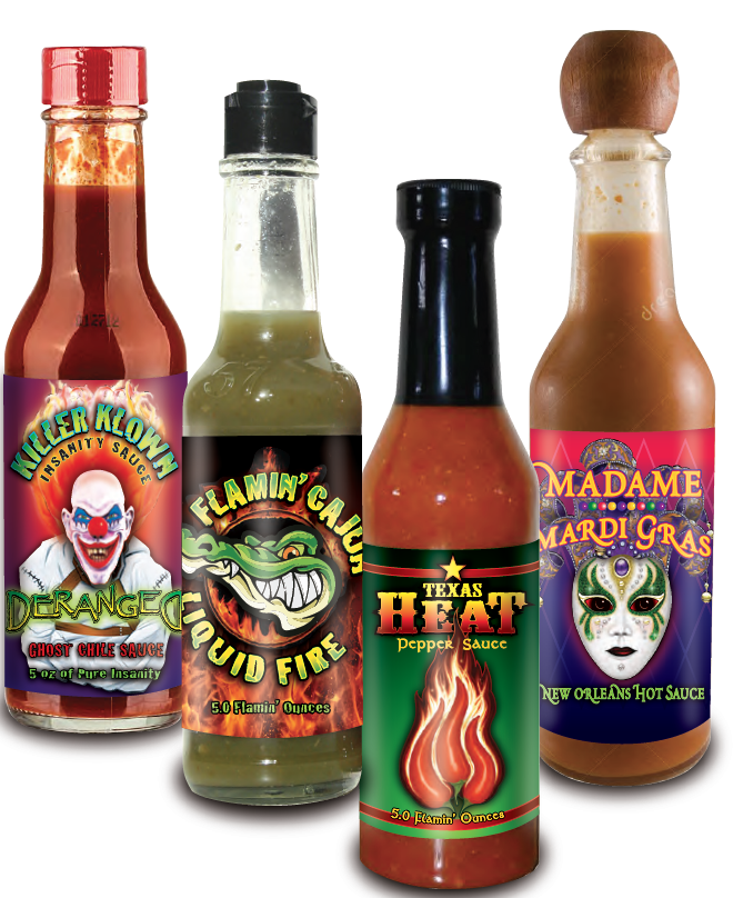
But remember, you are trying to communicate important information to a wide range of customers from small children to seniors with vision challenges. So keep it simple. If you use too many different fonts, the label will be harder to read and the design will appear confusing. The first label above uses four different type faces which makes the design seem disconnected.

We suggest sticking to one or two fonts for smaller food labels and keep the style changes to a minimum.

Brand Name Type Size is Too Big or Too Small

Find the balance between the size of your brand name text, the product info and other copy on the label. You don't want your brand name to get lost in the label but you also don't want people to miss out on the important details of your product.

Keep your brand name more prominent and above the other information. Second in size should be the product name, the the other information.

Font is Hard to Read

Since you only have a few seconds to catch a shopper's attention, you need your product's name and message to be spotted first. Choose clean fonts that are clear and easy to read both from a distance or up close.

Decorative fonts are usually used to convey a feeling or style. Some are formal, some playful, some serious and business-like. Using two or more decorative fonts together can end up sending a mixed message that often clashes. Pick fonts that go well with your logo font. San serif fonts are usually easier to read at small sizes like for your ingredients list.

When you are designing a label, try coming up with a couple of different versions to test on co-workers to see their reactions. A little test marketing of your label design and font selection can help make your product perform better in the store.

In addition to these being good design practices, they can also be regulated by the FDA. Read about General Food Labeling Guidelines by the FDA here.

 New Call-to-action

Read More

Topics: Food Labels


VIDEO: What Makes A Great Label?

Posted by Chris Erbach

Apr 11, 2014 11:30:52 AM

Ever wonder how labels get made?

Watch our quick video for a behind-the-scenes view of the Weber label manufacturing. 

We take great pride in helping our customers get the right label for their product, from blank labels for cartons to high-quality custom color labels on exotic materials. Our experts can guide you all along the way and help you get the best pricing for your project. 


Contact us today to get samples of Weber's high-quality, precision-printed pressure-sensitive labels that are designed to elevate the visual appeal of your products. With our extensive range of label options, from vibrant custom colors to durable materials, we can help you enhance the overall branding and packaging of your products.

By requesting samples, you'll have the opportunity to see firsthand the exceptional quality and attention to detail that goes into each and every label we produce. Our team of experts is dedicated to ensuring that you receive labels that perfectly match your product's specifications and meet your branding objectives.

In addition to receiving samples, we also offer a complimentary quote for your label project. Our experienced professionals will work closely with you to understand your requirements and provide you with the most competitive pricing options. 

Don't miss out on the chance to experience the difference that Weber labels can make for your business. Contact us today to request your samples and discover the possibilities for your packaging and branding needs.

.

Get free label samples

Read More

Topics: Labels, Food Labels, HP Indigo label press, custom labels, blank labels


Why Your Hot Sauce Label is the Secret Ingredient

Posted by Margaret O'Leary

Apr 1, 2014 11:28:14 AM

Hot sauce is quickly becoming one of America's favorite condiments. In fact, its popularity has grown 150% since 2000. This means there's more demand than ever for the best hot sauce.

Beyond big brands like Tabasco and Cholula there are thousands of small businesses making delicious sauces for grocery stores, farmers' markets and novelty gift shops. Because there is so much competition among these small brands, the label is often the deciding factor in the purchasing process.

Here's what you can do to make your hot sauce stick out

Consider the 2' x 2' space on the grocer's shelf your brand's billboard. Your label should communicate a couple of things:

Always share the details the customer needs to know:

  • Varieties of heat, usually on some type of scale
  • Taste and flavor of your sauce - sometimes denoted by region (Texas, Cajun, etc.)
  • Type of peppers used
Show your brand's originality:
  • Bright colors, eye-catching graphics and memorable names often distinguish what would be considered a collectible as a opposed to run of the mill brand name sauces.

  • Whimsical descriptions, parody names, even bottle design or add-on gimmicks provide that little extra to make one product stand out from the other.

Like wines and craft beers, sometimes the visual appeal of the label and bottle sell the product, not just what's inside. So when your hot sauce bottle is viewed as a piece of art in a sea of bland packaging, the consumer's eye will be drawn in.

Don't forget that the type of material matters too!

Keep in mind where and how your product will be used. Dripping sauce and sticky fingers are common problems your label will need to withstand. To protect the artwork and quality, make sure you use a laminate over the paper label or even select a film label.

And with the HP Indigo Digital press you can have your entire line of sauce labels printed at low order minimums. This will give you the flexibility to experiment with new blends or even create special event or limited time offers without breaking the bank.

See our sauces page for more tips or contact an expert below.

Contact a Hot Sauce Label Expert
 

Read More

Topics: Food Labels


FDA Announces Proposal for Improved Nutrition Facts Label

Posted by Margaret O'Leary

Mar 11, 2014 8:28:02 AM

The Nutrition Facts Label proposal has finally been announced! As we mentioned before, this will be the first major change in decades for these iconic labels.

The FDA hopes these changes will address public health issues like obesity, heart disease and diabetes by providing more realistic information. Using new technology and a better understanding of health issues, the FDA believes these labels will help consumers make better decisions and understand more about what they eat.


Here are the major changes proposed:

Bigger and Bolder Calorie Count

The FDA proposes that the calorie count be one of the boldest and most prominent lines on the label by using larger text.

Food manufacturers will no longer be required to list calories from fat since nutritionists say that information isn't as important.


Added Sugar Line

As we predicted in our last post, the FDA would like to add an additional line under sugars for "Added Sugars." These reflect the amount of sugar added in addition to the natural sugars in the product.


Vitamin D and Potassium Listed

The proposed label will require food manufacturers to list the amount of Vitamin D and potassium.


Serving Size

And finally, the biggest change to the Nutrition Facts food label is serving size. As we mentioned before, the serving size information was determined in 1990. The FDA proposes that the serving sizes be based on what is typically eaten by consumers today. This means food like ice cream could jump from half a cup to a full cup.

Also, some foods may require two labels. One that lists the Nutrition Facts per serving size and one that lists the facts of the entire container. This will make calorie counting simpler.
 

The FDA believes that the less math the consumer has to do the more time they have to understand the label and hopefully make healthier choices. There are several studies that show that people who regularly read Nutrition Facts labels are healthier. The purpose of this label is to inform the customer.


How Long Will It Take to Change

There will be a 90-day comment period for experts and members of the public to give their input. The FDA will then issue a final rule after the 90-day period. At that point, manufacturers will have two years to implement the changes.

 If you have any questions about nutrition labels or any other food labeling, talk to one of our Label Experts.

Contact a labeling expert from Weber.


Read More

Topics: Food Labels


Big Changes Coming to Nutrition Labeling

Posted by Margaret O'Leary

Feb 26, 2014 2:39:07 PM

This Thursday the White House will announce the first major changes to mandated food nutrition labels since 1990. Recently the FDA announced that they sent the White House new guidelines for the food labels based on new health information and American eating habits.


Why are they changing?

A lot has changed in America's eating habits since the nutrition label requirement was put in place. As more Americans become aware of dietary issues or want to eat healthier, there is more demand for clear nutrition labeling.

In fact, a USDA study found the number of working adults who frequently read Nutrition Facts labels rose from 34 percent in 2008 to 42 percent in 2010.


Predictions on Food Labeling Changes

1. Calories Section

The most common suggestion for labeling changes is to make the calorie count on labels more prominent. Nutritionists today make many dietary suggestions based on calories. Some also recommend removing the "Calories from Fat" information in order to focus on the overall calorie count.


2. New Line for Added Sugar

Today food manufacturers are not required to separate natural sugars from added sugars. Nutritionists believe it's important to add a line for added sugars.

However, of all the proposed changes, this one is sure to have the most push back from the food industry since it claims it isn't possible for it to distinguish the two in it's labs.


3. Whole Wheat Information

Food manufacturers can say that a food product is "whole wheat" even if the food only contains a small amount. Nutrition advocates are pushing for a listed percentage of whole wheat.


4. Clear Unit of Measure

Because America does not use the metric system as its primary measurement system, it can be confusing for the average consumer to understand how much sugar they're actually eating. Nutritionists suggest a familiar unit like teaspoons rather than grams.


5. Updated Serving Size

Have you ever eaten a snack that you assumed was a single serving only to find out it was one and a half? The serving size information was created based on the eating habits of American's in 1990 and earlier. As our diets have changed and we've increased "on-the-go" eating, there is a need to adjust this part of the food label.

Read More

Topics: Food Labels


Sweet Food Labeling

Posted by Margaret O'Leary

Feb 10, 2014 9:00:00 AM

When I think about February, I always think of chocolate. It's a month full of Valentine's Day sweets! To celebrate we're highlighting our friends at GrownUp KidStuff. They produce delicious gourmet chocolate sauces and use visually-striking labels.


A Gourmet Artisan Brand

GrownUp KidStuff is a family-owned business out of Evanston, IL that specializes in artisan sauces. They make 4 chocolate sauces, a butterscotch and a caramel each packed in 11 ounce jars.

Like many other small businesses, GrownUp KidStuff must compete for shelf space and sales with long-established, national brands.

As a result, the job of standing apart from these mega-brands often relies on attractive labeling.

The label, designed by Don Strandell, underscores the playfulness of the company name while incorporating important product, nutritional and warming information. Unfortunately, they were having some challenges with their labels color consistency when we met them.


The HP Indigo Solution

We invited GrownUp KidStuff co-owners Don Strandell and Connie Wastcoat to our plant for a tour and to discuss their current label challenges.

After a discussion on color consistency and quantity we determined the best solution for their labels is to print them on the HP Indigo WS6000 digital label press.

Brands like GrownUp KidStuff do not have the space to hold an inventory of labels and often make changes to their products based on the demands of their customers. Running these on the digital press keeps their order minimums low and allows for even smaller minimums on one label and higher quantities for their most popular flavors.

Our Graphics team worked with the label designer, Strandell, to select the specific browns they wanted to be a part of every label.  We also made sure the label material could withstand the storage environment.  Chocolate sauce jars are stored on store shelves, refrigerators and heated in a microwave. Not only does our Semigloss material hold up to those changes but with the added laminate any sauce that touches the label will not ruin the design or wipe out important health information.

We understand that the package needs to represent the hard work Strandell and Wastcoat put into their work. A high-quality product shouldn't be packaged with a poor quality label.


Read More

Topics: Digital Labels, Food Labels


Follow Weber Packaging Solutions

Twitter-1 Facebook-1 YouTube-1 RSS Pinterest-Logo-Vector-by-Jon-Bennallick-02-1 LinkedIn-1


Download Users Guide to Labels

Subscribe to Email Updates

Recent Posts

Posts by Topic

see all