Labeling Innovations from Weber

HP Indigo Digital Press Makes Personalized Packaging Possible

Posted by Margaret O'Leary

Jul 17, 2014 2:09:08 PM

DanLauraCokeLabelShare a Coke


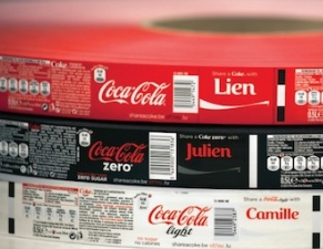
The very popular "Share a Coke" campaign has officially come to the US! Last year our VP of Manufacturing visited HP Indigo's headquarters and learned all about the project that was sweeping Europe. This campaign encourages consumers to find their friend's name on a label and share it with them.

Now in US stores you can find Coke products with a unique name or saying instead of the traditional Coca-Cola logo. This campaign not only promotes personalization but it also encourages customers to engage with the brand by sharing a Tweet with a hashtag #ShareaCoke.

How did they choose these names?

The campaign is primarily targeting Millennial consumers who look for personalization in brands. Coca-Cola selected hundreds of the top names of Millenials for their labels. If your friend's name isn't included in this list, don't worry, they also created labels that say "Friend", "Star", and "Bestie" for millions of Coca-Cola, Coca-Cola Zero and Diet Coca-Cola bottles. Have you seen your name or a friend's on a label? Search for your name at the Share A Coke website.


HP Indigo Digital Printing Technology

CokeLabelRoll
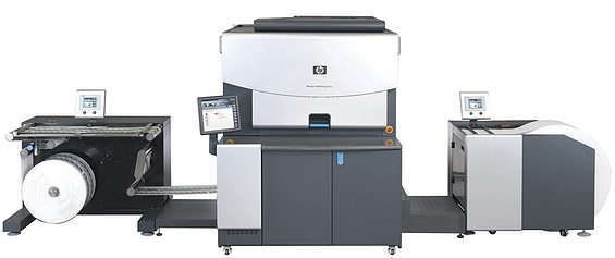
This campaign would not be possible without digital print technology. To complete a project like this, Coca-Cola had the labels printed using several HP Indigo WS6000 digital presses.

Here's why:

On Press Variable Printing
The biggest aspect of this project is printing a large amount of SKUs or label versions. Typically a label project might have a family of a few flavors. That alone can be a challenge to print so imagine over 100 SKUs making up 800 million labels!

No Plates Required
If these were printed in a traditional method a plate would be required for each unique label. And every time the press would need to switch plates additional time, labor and cost would be required to complete the job. The digital press can easily switch from one name to the next without stopping the press.

Color Consistency
Color consistency is crucial for a project of this size. If the red doesn't come out "Coca-Cola red" each time it will be noticeable on the store shelf. We work with many food brands that require consistency for their digital labels and this is easily achieved on our HP Indigo presses.

One Shot Printing
With digital printing the entire image is printed in one shot. This means the label goes through one station to get the entire image rather than run through a long press that includes several ink stations. The HP Indigo process of printing all the colors on a blanket and then printing the image in one shot yields perfect color-to-color registration. No color trapping is required, allowing a clean crisp print job.

More Options
As you can see, using the HP Indigo press gives your company the flexibility to easily print variable data on your labels for personalization or other creative purposes. Coca-Cola used this feature to build brand loyalty with a younger generation of consumers while having a little fun along the way!


HPWS6000Press


Read More

Topics: Digital Labels


How do I comply with GHS regulations for chemical bottles?

Posted by Margaret O'Leary

Jul 8, 2014 3:01:00 PM

GHS-labels-on-containers-smallBy now you've probably heard that OSHA is requiring updates to the Hazard Communication Standard label to comply with the Globally Harmonized System (GHS) label. As we've mentioned before, the challenge for chemical manufacturers and distributors will be the multi-color requirements of the GHS label.

In the past, your label manufacturer would print thousands of your labels with a template of the HCS label. Using your thermal-transfer or direct-thermal printer, you would then imprint the variable product information required by your industry. With the new GHS labeling format the red diamonds cannot be left blank in a template form, they essentially become part of your variable information.

We've talked about using an Epson ColorWorks in an earlier blog. This allows a manufacturer to print large drum and pail sized labels with durable materials and ink. But an interesting issue came to light on our own manufacturing floor: the relabeling of small chemical bottles used on our label presses.

GHS-labeled-bottle-on-pressIf your manufacturing facility is like ours and you need GHS labels on small bottles around the plant, try what's worked for us. All of our small chemical bottles are labeled by our Safety Team using the Epson ColorWorks C3500 Inkjet Label Printer. We're able to print all of the necessary GHS safety information using durable inks and materials that won't run when they come into contact with the chemicals.

This is an affordable printer that will fit nicely into your manufacturing process. Take a tour of the Epson ColorWorks C3500 with our Vertical Markets manager, Paul Johnson.


Don't forget the GHS mandate deadlines are approaching! Keep in mind these importants dates for GHS labeling.

  • June 1, 2015: Deadline for manufacturers to start using new GHS labels
  • December 1, 2015: Deadline for product distributors to begin using new GHS labels
  • June 1, 2016: Deadline for updated alternative workplace labeling and hazard communication program


 If you're experiencing challenges with GHS regulations, get a free audit from our GHS experts to learn if you're complying properly. 

GHS_e-book_cover

Download Weber's Guide to GHS Labeling 


Read More

Topics: GHS Labeling


Why does an unwind direction matter when ordering labels?

Posted by Margaret O'Leary

Jul 3, 2014 8:44:55 AM

It's time to order a batch of labels for my new product. I need to get this label order right the first time so production goes smoothly. What information does my label printer need from me?

There are a lot of specs you need to give to your printing company when it's time to order new pressure-sensitive labels. These usually include:

  • Label material
  • Label adhesive
  • Final label size
  • Number of colors
  • Special label features (like booklet, coupon, extended text, etc.)
  • And the Unwind direction

What is the unwind direction?

zt410-thermal-printer-zt41042-t01c000z-6f1

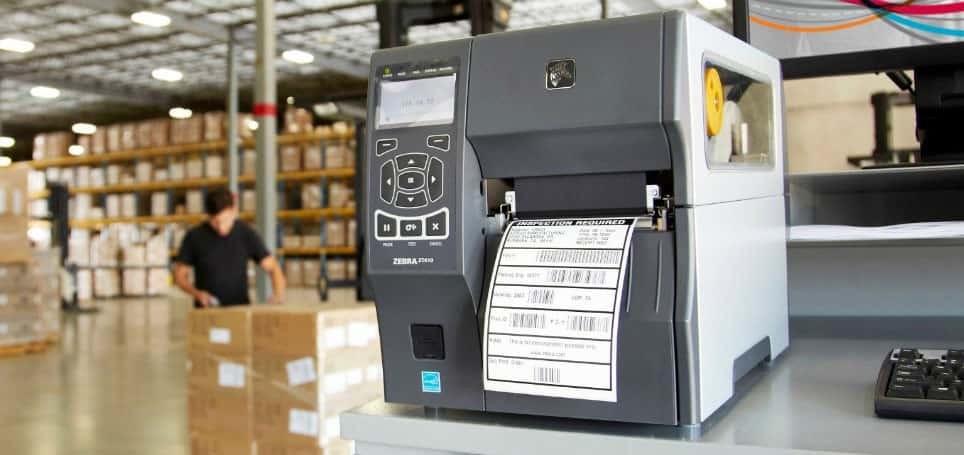
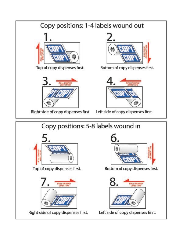
The unwind direction is the orientation of the label as it will feed out of a label printer or label applicator. There are eight different directions you could choose from for your unwind direction. Depending on whether you are applying them by hand or using automated machinery, this can be a critical factor.

If you are using a label applicator, make sure that you pick the correct orientation for your label to feed out onto your product. You don't want the label to be applied upside down! And some label applicators feed differently so be sure to check with your packaging team to make sure you order the labels with the right feed direction.


Why it matters

tronics-applicator-close-up

If your labels are to be fed out of a label printer or label applicator, then it is very likely that the label orientation is critical to the application. If you don't pick the correct unwind direction, you risk printing your barcode or other variable data in the wrong spot or even over your artwork. Selecting the correct direction also means you won't need to adjust your applicator because the labels are applying upside down!

Check out this handy guide to the various rewind directions.

RewindChart2013

Next time you are near your labeling operation, see if you can use this chart to figure out your current label orientation. Maybe you need to adjust it on your next order to improve labeling efficiency? If you are unsure or need help figuring it out, give us a call or email for more information.

Read More

Topics: Labels


Improve your food labels with a color label printer

Posted by Margaret O'Leary

Jun 26, 2014 1:47:49 PM

Honey_Bee_farms_Label-1It's Farmers Market season! Each weekend in my neighborhood local artisans and farmers come to the park to sell baked goods, cheeses, jams, sauces and so much more. For many of these small businesses this is the first step in their retail journey, with the ultimate goal of selling their product in gourmet shops or grocery stores.

Because of cost, packaging is usually just for protection and not marketing. And while the packaging at a Farmers Market might not be as important as a traditional store, it still can make a big impact.

Many people use small address labels from the local Office Max that are either hand-printed or run through a cheap home printer. That doesn't do much for your product. A simple way to upgrade your brand is to add a colorful label applied to the plain packaging. your label can include contact information, nutrition facts, and a fun colorful logo to draw in customers.

A big reason that some small food brands steer away from using color labels is the cost. If you only need a few hundred labels a season or need to make changes frequently to the label, getting your labels pre-printed might be a challenge. But there is hope.

If you're looking for really low quantities but want good looking color labels, we recommend an on-demand printer like the Epson Colorworks C3500. You can print the labels as you need them so if you want to test a new product or need to make changes to the label quickly you can do that with little investment in time and money.

This printer is perfect for food labels like cupcakes, breads, hot sauce bottle labels or artisan soaps.

Take a tour of the Epson ColorWorks C3500 with our Vertical Markets Manager, Paul Johnson, and see how compact and easy it is to use.


Read More

Topics: Food Labels, Label Printers


Avoid These Food Label Design Mistakes - Part II

Posted by Margaret O'Leary

May 19, 2014 1:53:00 PM


Whether you're having a label manufacturer print your labels or you're printing them yourself in-house with an Epson or QuadraColor label printer, you'll need a good label design.

In the first part of this series we covered typical font mistakes in food label designs. In part two we're focusing on the layout and colors of the design. Our label example for what not to do is a bit far fetched, but we have actually seen some pretty bad label designs that would surprise you.

 Cupcake-label-example-2

Part II: Layout and Color

Clashing Colors

There is a difference between having an out-standing label and a label that just stands out (usually not in a good way).

When designing a label, it's important to pick colors that complement each other and don't distract from the message your label is trying to show. In this example, the bright green color clashes with the 4th of July cupcake theme, making it hard to read the text and giving the viewer an uncomfortable feeling when looking at the label. It also makes the cupcakes look unappetizing.

Crowded Images

Too many images on your label will make it hard to focus on what you're trying to sell. In this label example there are multiple cupcakes that keep you from seeing a clean, clear vision of what the product looks like. The text is crammed together, making both the headline and the title above the ingredients hard to read. Finally the UPC bar code doesn't have enough clear white area around it to ensure a good "read" at the checkout.

Mixed Messaging 

When you are selling food, you want your label message to be delicious, healthy, and clean. It literally has to look good enough to eat. The forklift in the example above is a totally unnecessary pun that doesn't work with the company name. Plus a greasy forklift might be the last thing you want to see related to a cupcake. 


These are just some best-practices for designing a typical food label. A label for your product may have different requirements. Just remember that just about all labels need to have a clean, clear design so they are readable from a distance, convey your message, and look professional. Your label is your brand and a reflection of your company.

Read More

Topics: Food Labels


Avoid These Food Label Design Mistakes - Part I

Posted by Margaret O'Leary

May 12, 2014 2:30:36 PM

When you create a label for one of your food products, say a delicious cupcake, you want the label to convey freshness, look appetizing, and give your customer all the information they need to complete the sale.

Your food label design is one of the main tools you have to communicate with your customers. This becomes even more important for brands without a large marketing budget and that are limited to small retail spaces or specialty shops. It's crucial that your label tells your story in an appealing way.

In this two part series, I will share with you some common food label design mistakes and how you can avoid them. To best illustrate this we have designed an example of a "before & after" label incorporating these mistakes and will share some tips for label improvement.

Cupcake-label-example


Part I: The Importance of Good Font Choices

Too Many Fonts

No matter which software program you use to design your label, it probably comes with a huge library of fonts. There are so many fonts to choose from when designing your label that it gets tempting to use all your favorites.

But remember, you are trying to communicate important information to a wide range of customers from small children to seniors with vision challenges. So keep it simple. If you use too many different fonts, the label will be harder to read and the design will appear confusing. The first label above uses four different type faces which makes the design seem disconnected.

We suggest sticking to one or two fonts for smaller food labels and keep the style changes to a minimum.

Brand Name Type Size is Too Big or Too Small

Find the balance between the size of your brand name text, the product info and other copy on the label. You don't want your brand name to get lost in the label but you also don't want people to miss out on the important details of your product.

Keep your brand name more prominent and above the other information. Second in size should be the product name, the the other information.

Font is Hard to Read

Since you only have a few seconds to catch a shopper's attention, you need your product's name and message to be spotted first. Choose clean fonts that are clear and easy to read both from a distance or up close.

Decorative fonts are usually used to convey a feeling or style. Some are formal, some playful, some serious and business-like. Using two or more decorative fonts together can end up sending a mixed message that often clashes. Pick fonts that go well with your logo font. San serif fonts are usually easier to read at small sizes like for your ingredients list.

When you are designing a label, try coming up with a couple of different versions to test on co-workers to see their reactions. A little test marketing of your label design and font selection can help make your product perform better in the store.

In addition to these being good design practices, they can also be regulated by the FDA. Read about General Food Labeling Guidelines by the FDA here.

 New Call-to-action

Read More

Topics: Food Labels


Follow Weber Packaging Solutions

Twitter-1 Facebook-1 YouTube-1 RSS Pinterest-Logo-Vector-by-Jon-Bennallick-02-1 LinkedIn-1


Download Users Guide to Labels

Subscribe to Email Updates

Recent Posts

Posts by Topic

see all